Statement of intent
My chosen theme for my GCSE photography project is 'Portraits', but the theme I will be using for portraits is 'Street Photography'. I have chosen this theme because I think it's quite different and it lets me use the skills outside of school I have learnt during this photography course.
In order to make a successful and unique final gallery, I intend to keep using research on my chosen theme for portraits. I will research a variety of different kinds of street photographers and use their work to inspire me to use my theme. I will use the work of 'Garry Winogrand' who also did black & white street photography to inspire me. Garry Winogrand was influenced by 'Walker Evans' and 'Robert Frank' who were American photographers. Winogrands style was different because he was never looking for a "pretty shot" and it was more casual. I will extend my knowledge by researching up different other photographers similar to my theme and I can also visit different places such as exhibitions to see what other photographers did. I hope to explore and understand more about my chosen theme, which will also make allow me to be successful and build up more ideas for my work.
I hope to capture a variety of photoshoots to explore my theme of street photography. I will make sure to do a number of photoshoots. I could do some in school as well to develop my ideas, but mainly outside because of my chosen theme and so I could use other artists as my inspiration and it will be more creative. I hope to capture different photographic genre such as portraits, close ups, depth of field and not close ups.
In order to support this project, I will look up different famous photographers to do with my theme and it will inspire me more and develop my ideas. I could research some famous photographers such as Garry Winogrand, David Gibson, Eric Kim, Vivian Maier and Henri Cartier-Bresson. Each of these photographers will influence me to develop my ideas.
Throughout this project, I will use a variety of techniques with the camera and experiment with different tools in photoshop to create my theme. I will explore different settings of the camera such as manual, white balance, ISO, aperture and shutter speed. I will also have my ISO on different settings and have my shutter speed on a fast shutter speed to make sure I capture every moment and so it will not be blurry. With photoshop I will use different tools, filters and layers to try and create my final image and experiment with different things.
Whilst doing this project, I hope to learn more about street photography and to carry out different research on particular artists and photographers. I also hope to use the skills I have learnt in class and use them outside of school.
I see my final piece as being a gallery of photographs taken from my photoshoots within this project. I aim to corporate them within my theme and to make them black & white.
Moodboards
Black & White


I have chosen these images because they all have a link with each other and it and the colors all match. Also it kind of sets a mood and I like the effect the blurriness gives, This inspires me because it will make me want to use this method in my work, so it stands out.
Colorful


I have chosen these images because they all link with each other and they have a contrast, also they are quite unique. In the colorful ones the models stand out because it's a bit darker than the background, which makes it stand out. This inspires me because it will make me want to use this type of theme in my work.
Photography research using the 4 C's

Composition
The subject of this image is the Great Depression and it shows the 'Migrant Mother'. It shows a women with three young kids and they all look like they are suffering because she has got her hands on her face and is staring away from her camera with her two other kids on either side of her leaning on her shoulder. In the image the photographer has used rule of thirds of about 2/3 of her body and 1/3 of her face. They have also used a deep depth of field because everything is in focus. There is a central eye view because the women is in the middle and the camera is the same eye level as the women and that's the first thing you probably notice. Also the sweet spot is her eye. The colors that have been used are black & white and that this time the photo was taken they didn't have digital cameras, they had to use film camera, which you had to put at the back of your camera and see how your picture would turn out. The ISO is about 1/2000. Also the color creates a mood, which is kind of a sad mood because you would feel sorry for the women as she looks homeless and she's also got three young kids. The photographer has also used a fast shutter speed of about 1/3000 to capture her suffering and the agony so people know what she is going through. The leading line is from the middle of her head to her bottom right corner and she makes a triangle shape with the baby and two kids. In my opinion the image is quite deep because it shows what they were going through at that time.
Content
Dorothea Lange was an American documentary photographer and photojournalist, best known for her depression-era work. The photograph that has become known as "Migrant Mother" is one of a series of photographs that Dorothea Lange made of Florence Owens Thompson and her children in February or March in 1936 in California. At the time, the great depression was happening in 1930 and this picture became iconic of the depression, and the most familiar images of the 20th century. Behind her are her children leaning on her shoulders using her as protection, hiding their faces. This women was in poverty and she had nothing; she had no husband, no job and no help. As you can see in the image she looks worried because she thought things were not going to get better for a long time. In the image you can see her two children leaning on her covering their faces. You can also see her holding her baby in her hand and the women has her hand on her face staring away from the camera and she looks scared. In the background you can see they are in a tent or a house. Lange used a 4 x 5 camera view for these photographs and i think it was taken on a film camera. This image was so powerful because it prompted the government to send 20,000 pounds of food to relieve starvation in a migrant worker camp.
Connection
The theme of this image is the migrant mother. The message is to for us to know how much the great depression effected people and it was so bad that people ended up like this and in extreme poverty. This image is relevant to my work because for my portraits theme I am doing black and white blurry portraits, so I will try and use this to inspire me to do my work like this.
Comment
In my opinion, I like how everything is set out and structured and I also like the color that has been used because it will make you feel something like it might make you feel sorry for them. A strength is that they have used the correct white balance and ISO and also the rule of thirds is equally set out. However, the image was posed so it doesn't actually show the actual reality of the great depression but it gives you an idea what was happening.
The 4c's
Context
Magdiel Lopez was born in Havana Cuba and he spent his years of childhood inspired by the colourful culture that surrounded him. Naturally, such an upbringing played an integral part in forming Lopez’s keen sense on style, art and design, which can be realised in his works today.
Looking for freedom and a better life, Lopez moved to the United States at fifteen, where he continued working on his skill for the next 10 years perfectly.
Lopez decided to reveal his work called “A Poster A Day”- releasing one piece of artwork on his instagram everyday for 365 days. Each day garnered more attention from a global audience, ultimately leading Lopez to be featured by the New York times, cosmopolitan, Entrepreneur and Awwwards.
To date, Lopez has worked with several brands such as, Apple, Nike, Absolute Vodka, MTV, Warner Brothers and etc. He currently has a partnership with with Adobe as a design mentor and creative.
This information was taken from https://magdiellop.com/about
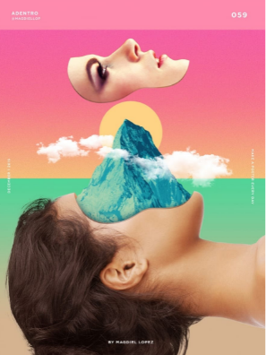
Composition
You can see that there is a line right in the middle of the image in between the two different background colours. The rule of thirds is used on the womens face. It is used at the top half. This makes it stand out especially with the bright pink background colour. The use of photoshop enhances the image. I think the tools they used to do this was the cut out tool to cut her face and to add the mountain on it. The studio set-up initially of a side profile and then enhanced the models hair and make-up. This is a clear image, so a fast shutter speed was used against a natural background so it could be manipulated easily in photoshop. A studio shot with lighting was used to highlight the natural face and hair and also a tripod was used.
Content
In this image, I can see the side profile of a woman’s face with a mountain and clouds on the woman’s face. Also there’s a pink and green background, with a sunset in the background. In my opinion, I think the image has a japanese style and this is suggested by the graphic effect that reminds me of a japanese print. His photoshop images are quite minimal in content but a simple style, but it also makes it stand out. In the background, there is a change in colour because there’s like a beige colour, then it blends in with green. Then above the green there is a light yellow colour that doesn’t blend in with the green, but then it blends in with the pink colour, so it created kind of like a sunset.
Connection
This image kind of connects with my portrait work because I also did face portraits, but mine was different because it was black and white and I didn't photoshop my images like that. I also didn’t use the similar tools as them. I like his work because even though he only does about one style, it still makes his work unique and stands out.
Magdiel Lopez was born in Havana Cuba and he spent his years of childhood inspired by the colourful culture that surrounded him. Naturally, such an upbringing played an integral part in forming Lopez’s keen sense on style, art and design, which can be realised in his works today.
Looking for freedom and a better life, Lopez moved to the United States at fifteen, where he continued working on his skill for the next 10 years perfectly.
Lopez decided to reveal his work called “A Poster A Day”- releasing one piece of artwork on his instagram everyday for 365 days. Each day garnered more attention from a global audience, ultimately leading Lopez to be featured by the New York times, cosmopolitan, Entrepreneur and Awwwards.
To date, Lopez has worked with several brands such as, Apple, Nike, Absolute Vodka, MTV, Warner Brothers and etc. He currently has a partnership with with Adobe as a design mentor and creative.
This information was taken from https://magdiellop.com/about
Composition
You can see that there is a line right in the middle of the image in between the two different background colours. The rule of thirds is used on the womens face. It is used at the top half. This makes it stand out especially with the bright pink background colour. The use of photoshop enhances the image. I think the tools they used to do this was the cut out tool to cut her face and to add the mountain on it. The studio set-up initially of a side profile and then enhanced the models hair and make-up. This is a clear image, so a fast shutter speed was used against a natural background so it could be manipulated easily in photoshop. A studio shot with lighting was used to highlight the natural face and hair and also a tripod was used.
Content
In this image, I can see the side profile of a woman’s face with a mountain and clouds on the woman’s face. Also there’s a pink and green background, with a sunset in the background. In my opinion, I think the image has a japanese style and this is suggested by the graphic effect that reminds me of a japanese print. His photoshop images are quite minimal in content but a simple style, but it also makes it stand out. In the background, there is a change in colour because there’s like a beige colour, then it blends in with green. Then above the green there is a light yellow colour that doesn’t blend in with the green, but then it blends in with the pink colour, so it created kind of like a sunset.
Connection
This image kind of connects with my portrait work because I also did face portraits, but mine was different because it was black and white and I didn't photoshop my images like that. I also didn’t use the similar tools as them. I like his work because even though he only does about one style, it still makes his work unique and stands out.
Mock exam:

In this image I can see that the photographer has blended two images together in order to create one whole image. I can aslo see that there is a reflection of the tress that goes from his head to his neck with the scenery also on it. The photographer has also made this black and white which I think has an impact on the image because black and white sets like a mood which makes it more dramatic in a way and sets more of a tone.
In this image I think the strong leading lines are from his head to his neck because when you look at the image the first thing you probabaly look at is his head. Around his nose and his mouth is where the sweet spot has been used because I can see that the lighting has reflected in that area and the eye view level would be the trees on his neck. The impact of this is that it makes you analyse the whole.
image and it catches your eye. When taking the picture of the trees, I would think that the photographer has used a quick fstop so he could capture the trees so that it could be clear and in focus properly. I think this image has just the right exposure and the editor has put the lightings in the exact right spot and it also kind of blends in. The photographer could have used a tripod so that the image would be more clear and not blurry. When editing this image in photoshop, they have used a number of tools such as the layers tool, the exposure tool, the blending tool and many more. The main colours in this image are black and white which has an impact on it because it builds up more of a mood. Also it goes from a really hard lighting to a quite soft lighting and blends in. To me I think that the image has been cropped in quite a unique way which make it stand out more.
I like this persons work because I think that it is quite different from other photographers and it looks like it takes a lot of time to make the image look like that. Their work links to mine because I have also been trying to create layers recently in photoshop and put two images together. The stenghths of this image is that the editor has been very thoughtful about it in the way he's blended the images together which I think makes it look more proffesional. Also I like the way the lighting just blends in from the head to the neck.
For my next outcomes, I would aspire to have some outcomes which are similar to that because it would be different from my others ones and I've also been trying to put two images together and create layers. It will also give me a chance to use different tools and experiment further. I am going to use this as an inspiration for my next outcomes so it gives me an idea of what I am trying to achieve.
Planning my first photography shoot for my portrait project

My starting point is taking inspiration from a photographer called David Gleave, who focuses on black & white portraits. I like the way his work is because it's kind of 'casual' in a way. I am going to be starting with some images of looking at people walking through Manchester and see if I can take any other Inspiration from them.
The equipment that I am going to have to use is a canon DSLR camera and I will need to put it on a tripod and use a fast shutter speed so it captures the person. I will use a colored background so it gets it in color first, then I will use Photoshop to make it black & white. I can also use the black & white filter from the camera, which I'm going to try aswell. I might need to use dark lighting so I can also have some of the shadows aswell. I will put my ISO on about 800 and do the white balance on cloudy or auto. I might use a reflector so the lighting is a bit softer but I wont be doing a studio set up, as I will be taking the photos outside and I'll already have a background. I'll also need to make sure my camera is fully charged and take a memory card in case the memory gets full.
My model is going to be Huda Mangera or I might get my family. I will ask them to wear just casual looking clothes and a jacket and I will tell them to be on the phone just walking and I'll take the photo and this will look more effective. I wont need to do their hair or make-up and it looks more informal.
Huda is available during my lesson, but I am going to be doing the shoot outside of school and I will need to find a location, Which is going to be Salford or I might do it in Market street. I chose these places because they are busy places, which is the kind of photos Im aiming for.
I don't think I am going to need any props, but I could use small things such as headphones or something.
I hope to capture at least 50 images, using different backgrounds and using different places, and use different lighting techniques.

These are the places I hope to go to take my photos.

My first photoshoot


Best images:


These are my best images form the photoshoot because I feel like they give of more street photography vibes and they all look well together.
Worst images:
These are my worst images because I don't like the lighting and they also look a bit blurry and I can't edit them properly.
Using photoshop


Outcomes:


Evaluation
The theme of this project was portraits. You could choose any theme to do with portraits and i chose to do black & white street photography because I thought it was different to everyone else's. I thought it was quite easy to do because my chosen theme wasn't complicated.
The part of the project I enjoyed the most was taking the pictures because I could go to different places to take the photos and I could go out more.
Some new techniques I experienced during this project was how to use Photoshop and adding different filters.
A technique I would like to develop is to try to be more creative with the black & white and to use the other different tools on Photoshop.
Some photographers I researched during this project were Garry Winogrand, David Gibson, Eric Kim, Vivian Maier and Henri Cartier-Bresson.
They influenced me because they're style of photography was the same as my chosen theme and I liked their photos.
The technique I enjoyed the most was using the different blur tools in Photoshop because I could experiment with different ones and different filters.
The most successful part of this project was that I was able to get 3 finals images that I photo shopped because they were quite easy to Photoshop.
Some problems I had during the project was trying to develop my ideas and I had to be abit more creative of how to use the black and white.
I learnt from them because and they affected my finals images because it wasn't just boring black and white and I experimented with different tools for them.
If I was given this project again something different I would do would to choose a different theme because after a bit I thought black and white was a bit boring
